The next in the series:
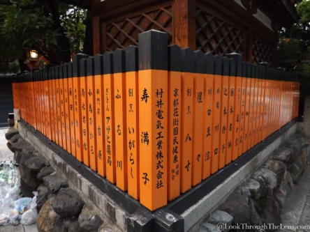
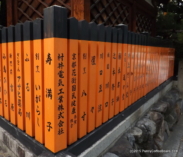
Can you spot the differences? The first image was taken without much regard to the garbage on the left. I thought I could crop it out… but it took two attempts to get the crop right. The first one cropped near the vertices kind of ruined my original vision of symmetry, though it kept the orange hues more. The 2nd crop was true to the original intent. I managed to improve a little… so here’s what I did.
I used auto balance to correct the light; then added a little bluish note via the temperature option. After auto settings to set some basic blacks/whites and so on, I adjusted a little clipping to strengthen the blacks/whites and then a slight orange tint. Then final radial filter with inverted masking emphasizes the center of the composition. Overall, I believe the composition is now stronger, closer to what I originally envisaged, and creates a better experience for viewers.
Comments?


