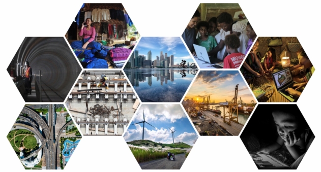
So the results are in from the recent APEC 2018 contest, and there are some strong contenders. Of course, my photos didn’t make it. But that doesn’t matter! It’s hard to know what internal selection criteria include or exclude. However, most of the pictures are pretty strong, except for one or two that I don’t think really are that effective at Instagram size, though they are all on theme, for sure. I would like to see them 24×16″.
I particularly like the top row: the left image would be really amazing hung up esp. the concentric rings (like an underground rainbow of sorts!); the middle for the reflection in rain water; and top row far right, because it succeeds where its top row neighbor fails. #4 on the top row has some issues that could be improved a little: we would love to know what everyone is looking at; reducing the image has darkened their faces a lot (solution: more light or raise the exosure a tad); and why is there a plastic bottle on the left?).
I like the bottom row #1, #3 and #4. While #5 is fine and picks up the theme, I don’t think there are many parents who’d think reading a pad in dim light is a good idea! I think #3 is very effective because of the juxtaposition of different era technologies suggesting improving environment; and I love the golden light in #4. I don’t think #2 works at small size because all the murky details just appear cluttered (of course, it’s a worksite) but make it bigger!
Congratulations to all! Well done on getting picked! Vote for your favorites here.

